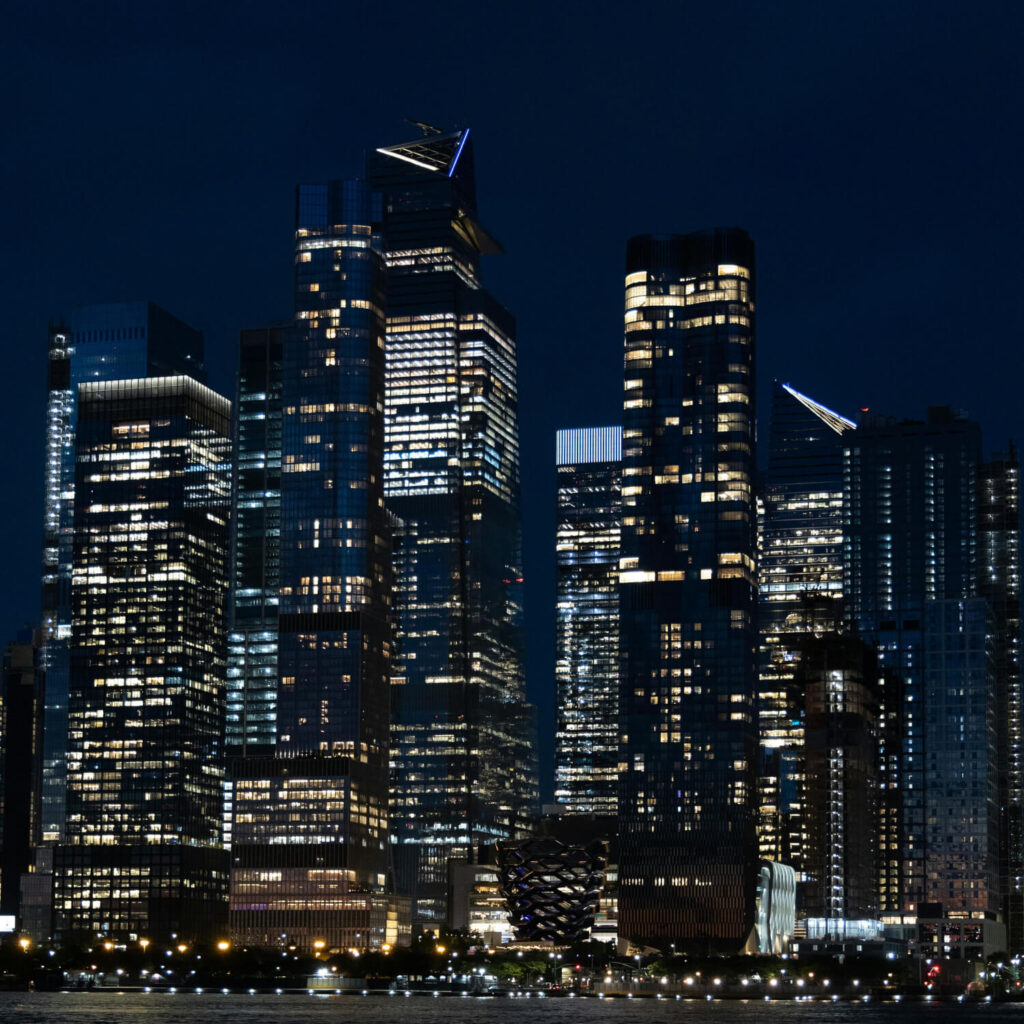
Dark mode, once a niche feature, has become a prominent trend in web design, with users increasingly opting for darker interfaces across devices and platforms. From reducing eye strain to conserving battery life on mobile devices, dark mode offers numerous benefits for users.
As designers and developers embrace dark mode, it’s crucial to prioritize readability, accessibility, consistency, and user preferences. By considering these factors and implementing dark mode thoughtfully, web designers can create engaging, user-friendly interfaces that cater to modern user preferences and enhance the overall user experience.
What We'll Cover
Understanding Dark Mode
Dark mode, sometimes called night mode or dark theme, refers to a design aesthetic where the background of a digital interface is predominantly dark, often with light text and elements. This contrasts with the traditional light mode, which features a light background with dark text. This website, for example, is light mode by default.
Trends Driving the Popularity of Dark Mode
Reduced Eye Strain
Dark mode can reduce eye strain, particularly in low-light environments. The lower brightness of dark interfaces can be gentler on the eyes. This helps provide a more comfortable browsing experience, especially during extended use.
Battery Conservation (For OLED Screens)
On devices with organic light-emitting diode (OLED) screens, dark mode can contribute to battery conservation. OLED displays can turn off pixels completely in dark areas of the screen. This saves energy compared to displaying bright white backgrounds. Contrast this to screens that are backlit, where the impact of dark mode on energy usage is less to nonexistent.
Aesthetic Appeal and Modernity
Dark mode is often associated with a sleek, modern aesthetic that appeals to many users. It can lend a sense of sophistication, elegance, and uniqueness to a website or application, making it visually appealing and on-trend.
Accessibility and Customization
For users with visual impairments or sensitivity to bright light, dark mode can improve accessibility by offering a high-contrast interface. Additionally, many platforms now allow users to customize their preferences to include light vs dark mode.
Considerations for Implementing Dark Mode in Web Design
While dark mode offers numerous advantages, it’s essential for designers and developers to consider several factors when implementing it in web design:
Readability and Contrast
Maintain adequate contrast between text and background colors to ensure readability, especially for users with visual impairments or readability challenges. Test color combinations to ensure readability in both light and dark modes.
Consistency Across Platforms
Ensure a consistent user experience across platforms and devices, including desktops, tablets, and mobile devices. Dark mode should be seamlessly integrated into the design without compromising functionality or usability.
Accessibility Standards
Adhere to accessibility standards and best practices. Make sure your images and fonts have sufficient contrast. Consider providing options for adjusting text size, contrast, and color preferences.
User Preferences and Switching Options
Offer users the flexibility to switch between light and dark modes based on their preferences. Include a toggle or settings option that allows users to choose their preferred mode, and remember their selection for future visits.
Branding and Visual Identity
Consider how dark mode aligns with your brand’s visual identity and aesthetic. Ensure that the color scheme and design elements in dark mode maintain brand consistency and reflect your brand’s personality and values.
Looking ahead
Dark mode has evolved from a trend to a preferred choice for many users across various digital platforms. Its benefits in terms of reducing eye strain, conserving battery life, and offering a sleek aesthetic make it a compelling option for web design. However, many users still prefer convention, with light mode as a more familiar experience. So, will you stick with light mode, embrace dark mode, or allow visitors to decide?


